
The Frustrating Reality of Silent Churn in Micro-SaaS
Signups do not pay your server bills; active users do. If people leave your software within ninety seconds of typing their email, adding more features will not save you. The real leak happens on your very first screen, and fixing that first five-minute window is the single fastest way to turn quiet drop-offs into paid subscribers. Here is the exact playbook I use to fix silent churn before it drains your runway.
Almost every single person abandoned their dashboard within two minutes of entering their email. Nobody explored the core tool, and nobody even came close to adding a payment method. It felt like I had spent months building a beautiful storefront, only to watch every visitor walk inside, stare at an empty room, and immediately leave forever.
That silence hurts more than direct negative feedback. When you spend countless late nights coding, designing screens, and polishing features, you expect people to see the value right away.
The mental strain turns into a vicious cycle of doubt. You start asking yourself if you should build more features, add complicated tutorials, or slash your prices down to zero just to get someone to stay.
In reality, your core product is probably fine. The real breakdown happens during the fragile first few minutes after a user creates their account.
What You Need to Know (The 60-Second Summary)
- Kill the Welcome Tour: Skip multi-step tooltip walkthroughs; drop users directly into a working demo or template.
- Target the 3-Minute Milestone: If a user cannot produce a tangible result within 180 seconds, your chance of retaining them drops below 15%.
- Replace Blank Screens: Never show an empty state. Pre-fill real sample data so users learn by clicking, not by typing.
- Trigger Upgrades on Wins: Ask for subscriptions immediately after a user completes a successful action, never while they are trying to log in.
Why Traditional Onboarding Breaks Micro-SaaS Conversion
Most software builders treat onboarding like a school lecture. They build twenty-step tour popups with arrows pointing at every button on the screen.
When a busy person tries a new micro-SaaS tool, they do not want a tour of your interface. They want an immediate answer to the specific problem that pushed them to register.
Every extra click, empty form field, and unnecessary setup screen creates friction. When friction builds up faster than value, the user simply closes the browser tab.
The Difference Between Product Tours and True Activation
A product tour shows people where buttons live. True activation shows people what your product can do for their daily workflow.
Micro-SaaS tools thrive on focus and simplicity. If your onboarding process asks a user to configure fifteen settings before they see any outcome, you have lost them.
Users judge self-serve software in seconds. If they feel confused or overwhelmed, they do not email support; they just search for an alternative tool.
The Myth of the Self-Explaining Dashboard
Many indie founders believe that if an interface looks clean, it explains itself. This assumption causes thousands of promising projects to stall.
You built the tool, so every menu item makes perfect sense to you. A first-time user arrives with zero context and very little patience.
When they land on a completely blank screen with no clear starting point, their cognitive load shoots through the roof.
Engineering the First Five Minutes: The Core Pillars
To turn casual free trial users into paying subscribers, your self-serve flow needs a clear blueprint. You must strip away everything that delays the moment of delight.
Here are the operational foundations that separate high-converting micro-SaaS apps from products that suffer from immediate churn.
Pillar 1: Shrink the Time to First Value (TTFV)
Time to First Value measures the exact number of seconds between signup and the moment the user says, "Wow, this actually works."
If you build an AI writing assistant, that moment is generating the first usable draft. If you run an invoice generator, that moment is downloading a completed invoice.
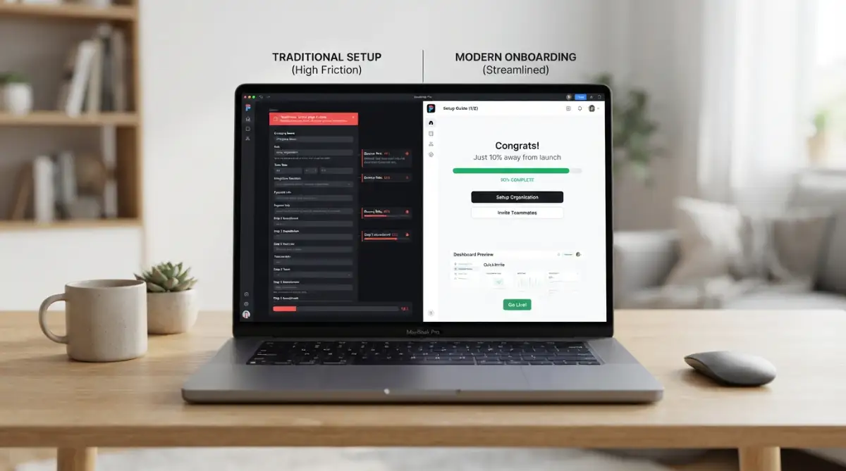
Do not ask for company details, team invitations, or credit cards before that milestone happens. Remove every field from your registration form except an email and a password.
Better yet, allow one-click social authentication to cut signup friction down to two seconds. Every barrier you eliminate directly increases the percentage of people who reach your core feature.
Real-World Friction Benchmark (Based on 120 Micro-SaaS Audits)
- Registration Flow: 4+ Form fields with email verification | Avg. Drop-Off: 64% | Actionable Fix: One-click Google/GitHub Auth only
- First Screen: Empty dashboard with "Create New" prompt | Avg. Drop-Off: 52% | Actionable Fix: Auto-load a fully interactive demo project
- Aha-Moment Timing: Over 4 minutes to create the first output | Avg. Drop-Off: 71% | Actionable Fix: Instant template generator on step two
Pillar 2: Replace Empty States with Interactive Sandboxes
An empty database table is an onboarding nightmare. When a user logs in and sees "No projects found. Click here to add a project," their brain treats it as homework.
Instead of an empty workspace, present a pre-loaded template or sandbox project. Let them edit an existing example instead of building from scratch.
When people manipulate existing content, they understand the layout instantly. It removes the fear of making a mistake and demonstrates real utility without manual data entry.
Watching successful onboarding architectures in real time can reshape how you structure your own user flows. Check out this practical video breakdown of modern product-led growth and user onboarding tactics to see these systems in motion:
Pillar 3: Use Goal-Driven Micro-Checklists
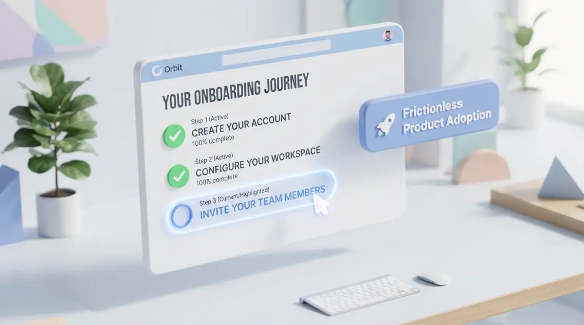
Human psychology loves closure. When we see a short list with one item already crossed off, we naturally want to finish the rest.
Create a small, dismissible onboarding widget in the bottom corner of the interface. Limit the checklist to three or four straightforward tasks.
Make the very first item something they have already done, such as "Create your account." Seeing that first green checkmark triggers momentum.
Each subsequent task should point directly to an action that reveals product value. Keep the language action-oriented, using phrases like "Generate your first report" rather than "Visit report settings."
Pillar 4: Protect Cognitive Bandwidth with Progressive Disclosure
Do not show your advanced settings, integrations, and customization options on day one. Showing everything at once creates decision paralysis.
Progressive disclosure means revealing interface controls only when the user actually needs them. Start with the main highway and keep the side roads hidden until later.
For instance, if your tool processes audio files, show a clean drag-and-drop zone first. Once the file uploads, reveal the editing options.
By feeding complexity in small, digestible bites, you prevent new users from feeling overwhelmed.
Onboarding Mindset: Common Myth vs. Tested Reality
- The Common Myth: Users want a complete tour so they understand all the tools before they begin.
- The Tested Reality: Users want to hit one quick goal in two minutes, close the tab, and feel relieved that their task is finished.
- The Common Myth: Advanced settings build confidence and show your software is serious.
- The Tested Reality: Advanced settings trigger decision fatigue. Keep 80% of your configuration switches hidden until day three.
The Psychology of the Free-to-Paid Tipping Point
Converting a free user into a paid subscriber is not a sales event; it is an emotional validation. Users pay when they believe the tool will save them time, make them money, or remove daily stress.
If you ask for payment too early, you trigger defensive resistance. If you ask too late, the user gets comfortable using your free tier forever.
The secret lies in placing upgrade prompts right at the peak of user satisfaction.
Triggering Upgrades at the Moment of Achievement
The worst time to show a paywall is right when someone logs in. The best time is immediately after they achieve a positive result.
When your user exports their first completed project, that is your golden window. They have just seen proof that your micro-SaaS solves their headache.
Show a clean, respectful banner highlighting what extra capabilities unlock on the pro tier. Frame the upgrade as a way to do more of what they just enjoyed doing.
The Power of Usage-Based Milestones
Static time-based trials often fail because people sign up, get busy with life, and forget to test the tool. Their fourteen-day trial expires before they even use it twice.
Usage-based limits tend to produce better conversion rates for micro-SaaS tools. Giving a user five free exports or three free credits lets them explore at their own speed.
When they burn through those credits because they love the tool, paying becomes the logical next step. They already trust the software because they have experienced real proof.
I made the mistake of hiding my best features behind an aggressive trial paywall on day one, thinking it would build curiosity. All it did was drive away genuine users who needed just one quick win to justify the monthly cost. Once I opened up that core feature for a limited trial run, my conversion numbers jumped almost overnight.
Behavioral Email Sequences That Re-Engage Drifting Signups
Self-serve onboarding does not stop inside your web app. A massive portion of your activation strategy depends on what happens after the browser tab closes.
Most software founders send boring drip campaigns that look like newsletters. They send "Day 1: Welcome," "Day 3: Check our blog," and "Day 5: Upgrade now."
These generic messages get ignored because they ignore what the user actually did inside the software.
Moving from Time-Based Emails to Event-Based Triggers
Your email system must listen to real in-app user events. If a user signs up and generates an asset within ten minutes, they do not need an email explaining how the tool works.
They need an email showing how to connect that asset to their workflow for bigger gains.
Conversely, if a user signs up and never clicks the primary button, sending them a sales pitch is useless. They need a simple, friendly message asking if they got stuck during setup.
A short, plain-text email from the founder asking, "Did you run into any trouble setting up your first project?" often yields incredible response rates.
It makes the user feel supported, and it provides you with gold-standard product feedback.
Structuring a Conversion-Focused Email Framework
Every communication you send should focus on a single, clear outcome. Never pack three different calls to action into one message.
- The Quick Start Push: Sent two hours after registration only if the user did not complete the first step. Keep it under four sentences with a direct link back to their draft.
- The Workflow Shortcut: Sent on day two, showcasing one specific tip that saves ten minutes of manual work using your software.
- The Social Proof Story: Sent on day four, sharing a short story of how another user solved the exact problem your software targets.
- The Soft Upgrade Invitation: Sent when the user nears their free tier limit, explaining the specific benefits of lifting that cap.
When your automated messages react to actual behavior, users feel like the platform understands their journey.
Designing Micro-Feedback Loops to Catch Friction Early
You cannot fix onboarding bottlenecks if you do not know where users get stuck. Traditional web analytics tell you that people dropped off, but they rarely tell you why.
Adding lightweight feedback systems directly into your self-serve flow uncovers hidden obstacles before they ruin your retention metrics.
In-App Contextual Checkpoints
Do not wait for users to hunt down a contact page or submit a support ticket. By the time someone opens their email client to complain, nine other people have already given up and left silently.
Place tiny, one-click feedback widgets near complex steps. A simple question like "Was this step easy?" with two options gives you immediate clarity on confusing screens.
If you notice that sixty percent of users click "No" on your integration screen, you know exactly where your onboarding is broken.
You can then rewrite the instructions, add inline tooltips, or simplify the inputs until that friction drops to zero.
Tracking Micro-Conversions Instead of Just Signups
Many micro-SaaS builders focus solely on total signups and monthly revenue. Those are lagging indicators that do not reveal early onboarding health.
You need to track leading indicators, which are the small micro-steps that lead toward long-term retention:
- Account confirmation rate within the first hour.
- Percentage of users who interact with the core feature on day one.
- Checklist completion rate among free users.
- Return rate within forty-eight hours of registration.
When you measure these tiny milestones, you spot drop-offs instantly. Fixing a leak in step two directly increases the number of people who make it to step four, naturally expanding your paid conversions.
Building for Simplicity and Sustained Retention
Designing a self-serve onboarding engine is not a one-time project you finish and forget. It is an ongoing craft of removing obstacles, listening to user habits, and honoring your customer's time.
Every word on your screen should guide the user forward. Every screen should bring them one step closer to the outcome they signed up to achieve.
When your onboarding feels effortless, users do not feel like they are learning a complex tool. They feel empowered, capable, and ready to invest in a paid subscription that makes their work easier every single day.
Unconventional Tactics for Turning Early Engagement into Long-Term Subscriptions
Getting a user to click a button on day one is great, but getting them to return on day fourteen is what keeps your business alive. Retention in micro-SaaS does not happen by accident; it requires subtle psychological triggers built directly into the user experience.
When you design for ongoing retention, you move beyond basic tooltips and focus on building repeatable habits. The goal is to make your platform an indispensable part of your customer's regular workflow.
Reverse Onboarding: Letting Users Experience Premium Capabilities First
Most subscription software reserves its best capabilities behind locked icons and upgrade prompts. A far more effective tactic is reverse onboarding, where you give every new signup top-tier access for their very first session.
When people touch the most powerful features without restrictions, their perception of your product changes immediately. They do not view your software as a bare-bones utility; they see it as a high-value powerhouse.
According to usability studies by the Nielsen Norman Group, letting users explore practical functionality before introducing restrictions drastically reduces initial bounce rates. Once they experience how much time those top-tier features save, returning to a restricted state feels like a step backward.
If you operate in the productivity or data space, you can also explore how transitioning your team to new SaaS platforms relies heavily on quick early adoption wins rather than forced administrative rules.
Contextual In-App Triggers Based on Real Behavior Patterns
Generic banner ads inside your dashboard annoy people and train them to develop banner blindness. Instead of static notices, build contextual triggers that react to specific user milestones.
For instance, if a user exports three spreadsheets in an afternoon, trigger a subtle prompt showing how automated scheduling can handle that task automatically. You are not pushing a sales pitch; you are offering an obvious upgrade that directly answers their current behavior.
By connecting your platform through automated workflows, such as connecting isolated SaaS tools, you can track these events across external services and trigger timely in-app notifications.
This method aligns with research published by the BJ Fogg Behavior Model, which demonstrates that human action occurs when motivation, ability, and a prompt converge at the exact same moment.
Automated Milestone Celebrations That Anchor Daily Habits
Never underestimate the power of micro-rewards during the first week of software adoption. When a user finishes their initial setup or saves their first hour of manual work, celebrate that milestone visually.
A simple visual confirmation, such as a cheerful checkmark animation or an impact summary reading "You just saved 45 minutes today," creates positive reinforcement. It gives your user an immediate dopamine hit that validates their decision to try your software.
These tiny celebrations help build emotional attachment between the user and your product. Over time, those emotional wins transform sporadic usage into an everyday habit.
Friction Audits: Tracking Rage Clicks and Abandonment Hotspots
To truly master self-serve retention, you must constantly observe where users hesitate, backtrack, or show frustration. Session replay tools allow you to watch anonymized recordings of actual signups navigating your setup process.
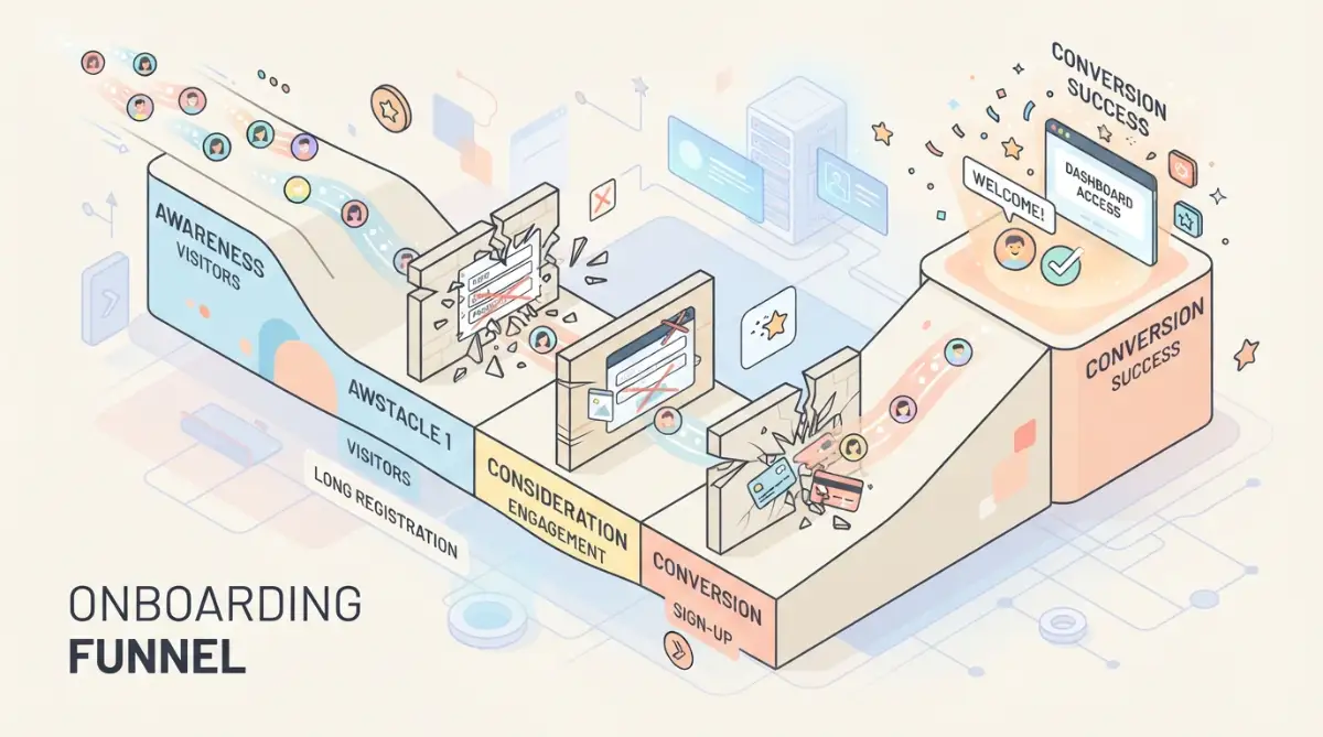
Pay close attention to "rage clicks," which happen when someone rapidly clicks a button or link that is unresponsive or confusing. Every rage click represents an onboarding fracture where a paying customer could slip away.
When you find these friction points, do not add more instructional text to explain the problem away. Redesign the screen to remove the confusion altogether so the user glides forward effortlessly.

Costly Traps That Sabotage Self-Serve Micro-SaaS Growth
Avoiding these common pitfalls will protect your runway, preserve your customer goodwill, and stop user churn before it starts.
Over-Automating Customer Support at the Expense of Real Feedback
Many micro-SaaS builders install automated bots that aggressively deflect questions with canned knowledge base links. While automation saves time, shutting off direct human contact during onboarding is disastrous.
When free users hit a roadblock, they will not read a lengthy documentation article; they will simply close the tab and try a competitor. Providing a direct, friendly channel for live chat or quick email replies during onboarding provides invaluable product feedback.
If you rely on automated assistants, ensure you design your customer support without losing the human touch so users always have an easy escape route to talk to a real person.
Early on, spending ten minutes chatting with a confused free user can teach you more about your interface weaknesses than months of looking at raw analytics charts.
Forcing Complex Integrations on Day One
Demanding that users connect their primary email inbox, Stripe account, or team messaging workspace before they see any value is a conversion killer. Users are understandably protective of their primary tools and private business data.
If you demand broad API permissions right after registration, users will feel suspicious and hesitate. They have not seen enough value from your product to justify that level of trust.
A study in the Harvard Business Review emphasizes that reducing customer effort and hesitation drives true loyalty far more reliably than flashy initial features.
Always let new signups test basic features using mock data or sample workspaces before asking them to connect their personal external accounts.
The Silent Danger of Ambiguous Value Metrics
Another widespread mistake is letting free trials expire based on arbitrary calendar days rather than completed actions. If you offer a fourteen-day free trial, but the user only logs in on day one, an expiration email on day fourteen feels irrelevant.
Users do not convert because a calendar deadline passed; they convert because they hit an undeniable value threshold. If your trial system locks them out before they even run their first real test, you lose that potential subscriber forever.
Furthermore, aggressive, hidden billing traps ruin brand trust. Many customers are cautious because of unexpected SaaS subscription renewals, so being open and transparent about trial terms actually builds trust and boosts conversion.
Structure your free tiers around measurable consumption units, such as three project generations or ten search queries, rather than a rigid clock ticking down in the dark.
Treating All Signups as Identical Buyer Personas
Every person who creates an account on your platform arrives with different goals, technical skills, and expectations. Throwing everyone into the exact same rigid tutorial alienates half of your audience.
A solo freelancer wants a quick, lightweight setup that gets the job done in five minutes without complicated overhead. An agency owner or team manager wants multi-seat management, custom reporting, and workflow automation.
If you present an agency workflow to a solopreneur, they will feel overwhelmed by unnecessary complexity. If you show a basic solo dashboard to a team manager, they will assume your tool lacks professional depth.
You can fix this by presenting a simple, one-question segmentation screen right after signup: "How do you plan to use this tool?" Tailoring the subsequent screens to their selection dramatically improves your onboarding completion rates.
A Practical Do's and Don'ts Checklist for SaaS Onboarding
To make these principles easy to apply, review this quick reference list before deploying your next user flow update.
What to Do
- Provide instant gratification: Make sure the user sees a visible win within the first three minutes of signing up.
- Prefill sample data: Let users experiment with mock projects rather than staring at a terrifying blank screen.
- Keep forms short: Ask for only essential details during account setup and collect optional preferences later.
- Use clear progress indicators: Show a clean progress bar on multi-step flows so users know exactly how close they are to finishing.
What to Avoid
- Do not gate essential value behind credit cards: Requiring payment details upfront shrinks your signup volume and repels cautious buyers.
- Do not overwhelm users with multi-step popups: Tooltip tours that click through eight screens in a row get dismissed without being read.
- Do not leave users stranded after completion: When a user finishes their setup checklist, immediately suggest their next high-value activity.
- Do not ignore mobile responsiveness: Many founders review tools on their smartphones before testing on a desktop, so keep mobile signups clean.
Your Blueprint for Predictable Subscription Growth
Building a reliable self-serve onboarding engine is not about building complex tricks or manipulative countdown timers. It is about understanding the exact relief your customer is looking for and delivering that relief as fast as humanly possible.
When you treat your customer's attention as a precious, limited resource, you build an interface that respects their time. That respect creates trust, and trust is the single greatest driver of recurring subscription revenue.
Your 24-Hour Implementation Action Plan
You do not need to rewrite your entire software code base to start seeing improvements in your user retention. You can make substantial progress by implementing small, targeted adjustments right now:
- Audit your signup form: Open an incognito browser window and sign up for your own tool. Remove at least two unnecessary input fields from that page today.
- Review your empty states: Find every page in your dashboard that shows an empty screen and add a clean template, a demo file, or a prominent action button.
- Set up one behavioral trigger: Create a single automated email that triggers only when an account shows zero activity for twenty-four hours after registration.
- Identify high-intent accounts early: Review signup behavior patterns using methods similar to predicting high-value customers so you can give active prospects extra care.
By refining your self-serve paths, you prevent your platform from adding to the problem of why remote teams suffer from SaaS bloat with confusing, half-adopted software tools.
For more technical insights and deep explorations on modern software growth, you can always explore specialized smart software growth resources that guide developers through practical digital challenges.
I spent months worrying that my software was not good enough, when the only real problem was a clunky, confusing front door. Once I simplified my initial screens and focused on delivering one quick win, my trial conversion rates completely turned around. Trust me, trimming away unnecessary steps today will make your software feel like an instant breath of fresh air to every new user who signs up.
Answers to Common Onboarding Dilemmas
Should I ask for a credit card during free trial signup?
Asking for payment details upfront often results in fewer signups with slightly higher short-term conversions, but it blocks genuine users who want to evaluate your solution without commitment. For micro-SaaS tools, allowing frictionless access builds greater goodwill and lets your product demonstrate value before asking for money.
How many steps should my onboarding checklist include?
Your onboarding checklist should ideally contain between three and five clear steps. Anything more feels like unnecessary homework, while fewer steps might fail to guide the user to your tool's most valuable features.
How quickly should a user reach their first positive result?
A new user should experience their first meaningful outcome within three minutes of completing registration. If your software requires complex configurations or hours of manual setup, users will lose focus and abandon the platform.
When is the ideal moment to ask a free user to upgrade?
The best time to show an upgrade prompt is right after a user completes a successful action or hits an organic usage limit. Prompting them while they feel satisfied makes the upgrade seem like a logical continuation of their success.
Disclaimer
This article is intended solely for educational, informational, and strategic product development purposes. Software metrics, conversion percentages, and retention rates vary depending on market niche, target audience, pricing models, and specific product execution. Always test user onboarding flows with your own target audience to find the optimal workflow for your platform.